


1.The Rule of Exaggeration
Super-normalisation and sub-normalisation of elements of the image.
2. The Rule of Purification
3. The Rule of Composition
4. The Rule of Heterogeneity
5. The Rule of Refinement
6. The Rule of Thematic Variation
7. The Rule of Neophilia
8. The Rule of Context
Bibliography
Morris, D (2013) The Artistic Ape. Red Lemon Press Ltd: London


After becoming interested in Eliasson’s art after visiting his 2019 exhibition at the Tate (See Exhibitions and research), I discovered an episode in the series Abstract the art of Design (Netflix, 2019) where he talks about his creativity. It was fascinating to listen to him discuss his life, his inspiration and the way he creates and develops his ideas. Nature and spectator are important to Eliasson and I especially like his awareness and sensitivity to current global issues such as global warming. I felt as though I really connected to the artist who allowed an intimate view of his creative process.
During my Assignment 1 feedback, my tutor mentioned using sketchbooks to develop ideas. I currently just use my sketchbook to do quick sketches but thought I might try to keep notes and inspiration in them. I have therefore made notes about Eliasson in my sketchbook with short words and phrases that might help inspire me in the future.
Bibliography
Abstract, The Art of Design. Olafur Eliasson: The Design of Art. Series 2 Episode 1 [Television Programme] Netflix 2019 (Accessed 19/11/2019)
During August, I was lucky enough to visit Eliasson’s exhibition at the Tate Modern with my niece and nephew (in their teen’s). I did not see ‘The Weather Project’ when it was installed at the Tate in 2003, but had heard so much about it, that I was really excited to see Eliasson’s work. Eliasson’s art is very immersive and heightens the awareness of the spectator’s senses.
Installations are inspired by nature, light, shadow, reflections, geometry, space, structure and perception.It was a hugely delightful exhibition and unlike most exhibitions was full of children! It was a real pleasure to watch my niece and nephew engage so fully in Eliasson’s work.


The installations and models felt so simple and playful to engage with. There were lots of illusions and reflections created by mirrors and lights that it felt at points as if you were in a large children’s fun hall. Your Spiral view (Eliason, 2012) felt as though you were walking through a giant kaleidoscope.
At points there were gentle and reflective pieces of art work which I seemed to connect with.I especially liked the glacier series (Eliason, 1999). These photographs captured the gentle, quiet yet powerful and awe-inspiring movements of a series of glaciers taken from the air to show their magnitude. I also found Glacial currents (Eliasson 2018) really fascinating. Eliasson explains :
‘These watercolours were produced using chunks of ancient glacial ice that were fished from the sea off the coast of Greenland. The ice was placed atop thin washes of colour on a sheet of thick paper. As the ice gradually melted, the resulting water displaced the pigment, producing organic swells and fades of colour.’

Glacial currents looked ‘otherworldy’ and could be and image of an undiscovered planet. The fact that this images was created by ancient ice blew me away. It was like nature transforming and expressing itself in an entirely new way! I would absolutely recommend this exhibition to all.. especially children!
List of Illustrations
Fig 1. Eliasson, O. (2019) In Real Life [mixed materials] photograph by author. In Real Life exhibition, Tate Modern 11/06/2019-5/01/2020)
Fig 2.Eliasson, O. (2010) Din Blinde passenger [water soluble fog] photo by author. In Real Life exhibition, Tate Modern 11/06/2019-5/01/2020)
Fig 3. Elliason, O. (1993) Beauty [water and light] photo by author, In Real Life exhibition, Tate Modern 11/06/2019-5/01/2020)
Fig 4. Eliasson, O. (2018) Glacial Currents Watercolour,[ Indian ink and pencil on paper] photo by author In Real Life exhibition, Tate Modern 11/06/2019-5/01/2020)
Bibliography
Eliasson, O. (2018) Glacial Currents (yellow, sienna). At https://olafureliasson.net/archive/artwork/WEK110876/glacial-currents-yellow-sienna
I was lucky enough to visit Venice over the summer holidays and discovered the incredible Biennale art festival. Over two days, I visited installations both in the Gardinia and the Arsenale districts as well as a few dotted around Venice.
Curated by Ralph Rugoff the theme of the 58th Bienalle ‘focuses on artists who challenge existing habits of thought and open up our reading of objects and images, gestures and situations. Their work grows out of a practice of entertaining multiple perspectives: of holding in mind seemingly contradictory notions, and juggling diverse ways of making sense of the world. ‘ (Rugoff 2019).
These are just a few of the many installations that really inspired me.
Puryear’s sculptures were all symbolic of ‘liberty, withholding liberty, or exploiting liberty.’ Using materials such as wood, bronze, iron, tar, mesh and granite, his work exudes simplicity of design with a solid, natural and powerful presence.
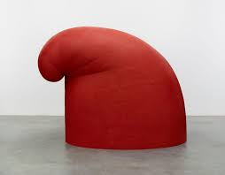
The Phyrygian cap was worn by Dacian prisoners in the early 2nd centruy Rome. Freed slaves wore the cap to demonstrate their freedom. During the French Revolution, the hat also symbolised liberty.
Africobra was founded in Chicago in 1968 by a group of young black artists who wished to ‘create a recognisable aesthetic for and about the Black community’ (Jeffreen Hayes, 2019 curator). Art was created with vibrant colours, rhythm, bold text and positive images of black people. I was mostly moved by the work of artist Jeff Donaldson who had several paintings in the exhibition.

This painting is full of so much energy and really captures the Jazz band experience. There are little glimpses of the musicians amongst all of the wonderful patterns that symbolise the exitement and unpredictability of the music. The colours are warm and inviting and give the painting a really positive energy.
In Great Britain’s pavillion the artist Cathy Wilkes had created an installation that felt quite dreamlike and meditative. In the main room a transparent box like structure was surrounded by four model children with pot bellies that suggest poverty or hunger. The box structure almost looked like a shrine with offerings laying around it. In other rooms simple objects were placed sparingly to create a melancholic atmosphere – a dirty lace tablecloth, old fashioned plates on the wall, a structure that might be a clothes drier/stepladder. All of the items had a quiet, calm presence due to their colour and spacing. This gave them the dream like quality of memories or flashbacks to childhood.

List of Illustrations
Fig 1. Puryear, M. (2010-2014) ‘Big Phyrigian‘ Painted red cedar photograph at https://www.culturetype.com/2014/12/12/in-new-york-for-the-holidays-17-exhibitions-for-your-agenda/ accessed 13/11/2019
Fig 2. Donaldson, J. (1988) Jam packed and Jelly tight (for Jameela) [mixed media on canvas] photograph by author Venice Bienalle 26/08/2019
Fig.3 Wilkes, C. [2019] Untitled [mixed media] photograph by author at Venice Bienalle 26/08/2019
Click to access C.%20Greenberg%252c%20Modernist%20Painting.pdf
-The essence of modernism lies in the methods of the discipline to self-criticise. To criticise from the inside spontaneously and subliminaly individually.
-Needs to demonstrate it is a valuable contribution to human experience. Each particular art had to exhibit its uniqueness.
-‘Modernism used art to call attention to art… the flat surface, the shape, the properties of pigment – were treated by the old masters as negative factors… Modernist painting has come to regard these same limitations as positive factors.’
-Modernism was defined by the flatness of the support. The old masters preserved the picture plane giving the illusion of three dimensional space. Modernists – ‘One is made aware of the flatness of their pictures before, instead of after, being made aware of what the flatness contains.’
-Modernist painting abandons the representation that 3D objects can inhabit. It has diverged itself from everything it might share with sculpture or other arts. Its uniqueness was flatness.
-Impressionists abandoned sculptural and Cubists created flatter paintings. Paint texture, value and colour contrast were tested/retested. Not necessary aesthetic qualities.
-Modernism has not broken with the past but devolved from.
‘Modernist art does not offer theoretical demonstrations.. it converts all theoretical possibilities into empirical ones, and in doing so tests, inadvertently, all theories about art for their relevance to the actual practice and experience of art.’
