Reflections on Part 5 and Self-Assessment

Reflections on Part 5

I have really enjoyed Part 5 of the course and feel as though it has sparked an interest in contemporary art. I was particularly drawn to the site-specific sculptures of Richard Serra and Nancy Holt. It has also encouraged me to explore video installations and I particularly felt as though I connected with the work of Bill Viola. Overall the whole of the Understanding Visual Culture course has been very rewarding as my knowledge and understanding of art has deepened significantly. I was especially interested in the modern art movement and how this developed. I have not visited an art gallery for over a year due to an injury and the Covid-19 pandemic so am very much looking forward to visiting the Tate Modern with a ‘new perspective’ and a better understanding of the works displayed there.

Assessment Criteria

Demonstration of subject based knowledge and understanding

I believe that my knowledge and understanding regarding contemporary art has improved dramatically and that this is reflected in my writing. I have spent a lot of time exploring subjects such as the genre of ‘institutional critique’. I had previously not heard of this term and quickly became aware that this type of art is something that I feel passionately about. Assignment 5 demonstrated my ability to compare and contrast two different uses of the same medium and how the use and placing of this medium creates different effects for the viewer.

Demonstration of Research skills

I am confident that my research skills have improved throughout this course as I am able to locate resources that help me to understand a subject. I have significantly improved my referencing as I take notes during research, I ensure that everything is referenced to author, location of work, date and page number. This helps me to reference accurately and easily when I am writing an exercise or assignment.

Demonstration of critical and evaluation skills

I have been successful thinking critically around a subject. I often research an area and then spend a lot of time thinking and reflecting upon it before I start to write. I feel as though I can apply concepts and wider current issues to the exercises and assignments which, I feel, helps my understanding on a deeper level.

Communication

Following feedback from my tutor, I now feel that my communication and presentation skills are well developed. I am able to organise ideas and thoughts by using subheadings. I effectively use illustrations to visually support the writing element of my work and this helps to engage the reader. I have become better at fully exploring ideas and insights and writing around quotes so that they are fully understood.

Exercise 5.5.

Watch Richard Serra’s films ‘Hand catching Lead’ and ‘Boomerang’. Familiarize yourself with his work and say why you think he made these films.

Richard Serra is mostly known for his minimalist sculptures that include works such as Tilted arc(1988) and Fulcrum(1987). Serra’s work was often site specific that gave the viewers an experience that was not just visual but physical as well. The placement of Tilted arc, a 12ft tall,120 foot long 15 ton slab of steel, across Federal Plaza in New York altered people’s experience of the space they inhabited. Instead of a sculpture that was looked at from a distance, Serra’s sculptures interacted and immersed themselves with the everyday lives of the inhabitants whilst altering their experience and perspective of that space (Dosh, M. s.d).

Lost Art: Richard Serra – Essay | Tate
Fig 1. Serra, R. (1981) Photograph by Susan Swider [steel] At https://www.tate.org.uk/art/artists/richard-serra-1923/lost-art-richard-serra (Accessed 31/07/2020)

During the 1960’s Serra explored the new medium of film to create art. Two of such films were Hand catching lead (1968) and Boomerang (1974) with artist Nancy Holt. By exploring these films it is possible to understand why Serra made them.

Hand Catching Lead (1968) is a short silent 3 minute black and white 16mm film in which an outstretched hand attempts to catch pieces of lead that appear to drop from above. The entire film is focused just on the hand as it opens and closes sometimes catching the lead (then dropping it) and sometimes not. The film records a repetitive and continuous action without any climax (Bukhari, 2017).

Fig 2. Serra, R. (1968) Hand Catching Lead [Film still] At https://lightcone.org/en/film-1326-hand-catching-lead (accessed 31/07/2020)

Serra was interested in the working processes of creating sculpture, whether by hand or through industrial means, and seems to explore this through film (Clark, M.E s.d. Accessed 31/07/2020). The artist’s 1967 “Verb List Compilation: Actions to Relate to Oneself” included verbs such as “to roll,” “to crease” and “to fold,”. Chayka (2011) explains that ‘the action, signified by the verb, becomes the art, rather than the resultant object.’ In the case of Hand catching lead the artist is focused on the action catching. Other works of this period capture the actions of the verbs splashing and scraping.

In Boomerang (1974) the artist Nancy Holt was recorded by Serra whilst hearing her words repeated back to her after a one second delay through headphones. The effects are quite extraordinary and Holt is able to articulate her experience during the 10 minute video.

Richard Serra and Nancy Holt's Boomerang (1974). 9
Fig 3. Serra, R. & Holt, N. (1974) Boomerang [film still] At https://www.researchgate.net/figure/Richard-Serra-and-Nancy-Holts-Boomerang-1974-9_fig9_325958388 (Accessed 31/07/2020)

Holt states ‘I am once removed from myself’, ‘I have a feeling that I am not where I am,’ ‘words become like things’, and ‘I feel that this place is removed from reality.’ Her thought process becomes interrupted and she starts to experience an altered sense of reality. Her experience of displacement and altered reality mirrors the effects that Serra creates through his sculptures that aim to disrupt and alter the perspectives of the people interacting with it.

It is likely that Serra produced these films to explore the creation of art through a newly available medium. His interests in the processes of creating sculpture are evident in Hand catching lead and the repeated effects of displacement caused by site specific sculpture are reproduced in Boomerang.

List of Illustrations

Fig 1. Serra, R. (1981) Photograph by Susan Swider [steel] At: https://www.tate.org.uk/art/artists/richard-serra-1923/lost-art-richard-serra (Accessed 31/07/2020)

Fig 2. Serra, R. (1968) Hand Catching Lead [Film still] At: https://lightcone.org/en/film-1326-hand-catching-lead (Accessed 31/07/2020)

Fig 3. Serra, R. & Holt, N. (1974) Boomerang [film still] At: https://www.researchgate.net/figure/Richard-Serra-and-Nancy-Holts-Boomerang-1974-9_fig9_325958388 (Accessed 31/07/2020)

Bibliography

Bukhari, K. (2017) Movements of Media in Yvonne Rainer’s Hand Movie (1966) and Richard Serra’s Hand Catching Lead (1968) In: The Internationl Journal of Screendance Vol 8 (2017) At: https://screendancejournal.org/article/view/5366/4641 (Accessed 31/07/2020)

Chayka, K. (2011) Richard Serra Cleans Off Desk, Makes Art At: https://hyperallergic.com/18491/richard-serra-lead/ (Accessed 31/07/2020)

Clark, M.E. (s.d) The Artist and his Work: Richard Serra At: https://www.guggenheim-bilbao.eus/en/learn/schools/teachers-guides/the-artist-and-his-work (Accessed 31/07/2020)

Dosh, M. (S.d) Richard Serra, Tilted Arc At: https://www.khanacademy.org/humanities/art-1010/post-war-american-art/minimalism-and-earthworks/a/richard-serra-tilted-arc (Accessed 31/07/2020)

https://en.wikipedia.org/wiki/Richard_Serra (Accessed 31/07/2020)

Serra, R. (1968) Hand Catching Lead [You tube video] At: https://www.youtube.com/watch?v=_NBSuQLVpK4 (Accessed 31/07/2020)

Serra, R. & Holt, N. (1974) Boomerang [You tube video] At: https://www.youtube.com/watch?v=8z32JTnRrHc (Accessed 31/07/2020)

Spampinato, F. (2015) Richard Serra: Sculpture, television and the status quo In: Vintage Autumn 2015 At: https://necsus-ejms.org/richard-serra-sculpture-television-status-quo/ (Accessed 31/07/2020)

Exercise 5.4

Does institutional critique presuppose an ‘insider’ audience requiring familiarity with artworld topics and issues or can it be understood by almost anyone spending an hour or two in a gallery?

Institutional critique is a genre of art that draws attention to the institutional framework of the art world. This can include the sale, display and value of art, the structures and commercial agendas that underlie art galleries, and the social, political, cultural and economic factors that determine what fine art is (Price: 2018). By examining some art work from this genre it is possible to determine whether a viewer would require ‘insider’ knowledge of the art world to understand it or if this type of art is accessible to all.

A movement that started in the 1960’s, artists such as Michael Asher and Hans Haacke started to question how neutral the museum, as an institution, was. In Untitled intervention (Fig 1.) Asher removed the partitioning wall in a gallery exhibition room to reveal an administrative area of the gallery normally unseen (Price 2018).

Fig 1. Asher, M. (1974) Untitled Intervention installation At http://www.noshowmuseum.com/en/1st-a/michael-asher (Accessed 26/07/2020)

No prior inside knowledge of art would be required to understand that this was drawing attention to and revealing the behind the scenes inner workings of the running of the gallery. As a viewer though one would need some indication that this was actually an art installation or they might think that they had wandered into an empty room!

In the same year, Haans Haacke drew attention to the relationships that galleries/museums have with certain private individuals. In Solomon R. Guggenheim Museum Board of trustees (1974) , 7 panels of framed text revealing connections between a number of the trustees of the Guggenheim museum and the Kennecott Copper Corporation in Chile were revealed. (Bois et. al. 2004:547). The neutrality and morality of these unseen influential individuals were open for debate. The accessibility for the viewer understanding this artwork would be questionable. Firstly, framed text is not usually expected in an art gallery and secondly, one would have to have some prior knowledge of the political situation in Chile and the role and influence played by the trustees.

During the 1980’s artists such as Fred Wilson critiqued the institution through exhibitions such as mining the museum (1992). The installation critiqued the neutrality of the museum when exhibiting artefacts that underrepresented Black and Native American local history. If the viewer was a regular museum visitor they would notice that the artefacts and the placing of them were unusual. They enlightened the viewer in a new way that raised awareness of a more honest version of history. Wilson also exhibited Guarded View at the Whitney museum in 1991.

Invisible Man: At the Whitney, Fred Wilson Comments on Status of ...
Fig 2. Wilson, F. (1991) Guarded View [wood, paint, steel and fabric] exhibited at the Whitney museum 1991 At https://whitney.org/collection/works/11433 (accessed 27/02/2020)

These black mannequins (with no heads) in museum guard clothing demonstrated the social inequalities experienced by the Black community within the art world. A Black person was more likely to work as an anonymous security guard or a cafe assistant than be an artist or a visitor to the gallery/museum (Price, 2018). Would the meaning behind Guarded View be accessible to the average gallery visitor? Perhaps this would require more thought and an awareness of Black and Minority Ethnic inequalities from the viewer.

Perhaps the most easily accessible art that critiques the institution is that of the Guerilla girls. This New York based activist group of anonymous female artists was formed in 1985. Their aim was to critique individuals and institutions within the art world that excluded or underrepresented women and minority groups (Dempsey, 2002:292).

Guerrilla Girls, ‘Do Women Have To Be Naked To Get Into the Met. Museum?’ 1989
Fig. 3 Guerrilla Girls (1989) Do women have to be naked to get into the Met. Museum? [print] At https://www.tate.org.uk/art/artists/guerrilla-girls-6858 (Accessed 27/07/2020)

With bright posters and statistics that highlight their critique of the institution (Fig 3.) any viewer can easily access the point being made by the Guerrila Girls. No insider knowledge of the art world is required as the facts are clearly stated and easily interpreted.

Conclusion

The genre of institutional critique does not require an audience to be familiar with art world topics and issues. However, some works (The Guerilla girls) are more accessible than others (Haacke). The aim of the works is to draw attention to the viewer the institutional structure and workings of the art world. The audience therefore needs to spend some time with the art work to enable a new way of looking and understanding. However, if the audience member is not open to new ways of looking and perhaps doesn’t consider the social, political and class issues in the wider society, they may struggle to see the significance of some of these pieces.

List of Illustrations

Fig 1. Asher, M. (1974) Untitled Intervention installation At: http://www.noshowmuseum.com/en/1st-a/michael-asher (Accessed 26/07/2020)

Fig 2. Wilson, F. (1991) Guarded View [wood, paint, steel and fabric] exhibited at the Whitney museum 1991 At: https://whitney.org/collection/works/11433 (accessed 27/02/2020)

Fig. 3 Guerrilla Girls (1989) Do women have to be naked to get into the Met. Museum? [print] At: https://www.tate.org.uk/art/artists/guerrilla-girls-6858 (Accessed 27/07/2020)

Bibliography

Bois Y-A et al. (2004) Art since 1900. London and New York, Thames and Hudson

Dempsey, A. (2002) Styles, Schools and Movements. London, Thames and Hudson

Farago, J. (2019) Hans Haacke, at the New Museum, Takes No Prisoners in The New York Times 31.10.2019 At: https://www.nytimes.com/2019/10/31/arts/design/hans-haacke-review-new-museum.html (Accessed 27/07/2020)

https://www.tate.org.uk/art/art-terms/i/institutional-critique (Accessed 27/07/2020)

https://en.wikipedia.org/wiki/Institutional_Critique (Accessed 27/07/2020)

Price, N. (2018) Institutional critiqueparts 1-4 Online video At: https://www.youtube.com/watch?v=ujE6ntrJdHM

Exercise 5.3

Take a work of contemporary art and imagine it was not and never had been a work of art.What is the difference? (100 words)

Installation view of Tracey Emin, My Bed, at the Turner Prize Exhibition, Tate Gallery, London, 1999-2000. Photo © Stephen White. © 2018 Tracey Emin. All rights reservied, DACS, London / Artists Rights Society (ARS), New York. Courtesy of White Cube.
Fig 1. Emin, T. (1998) My Bed  at the Turner Prize Exhibition, Tate Gallery, London, 1999-2000. © Stephen White At https://www.artsy.net/article/artsy-editorial-tracey-emins-my-bed-ignored-societys-expectations-women (Accessed 24/07/2020)

If Tracy Emin’s My Bed (1998) had not become a work of art, it would just be part of someones (in this case the artist’s) personal living space. The clutter around the bed is unique to the individual concerned and their personal experience of life. Every human being has a sleeping space so a bed surrounded by clutter/objects would just be seen as a part of everyday living.

Bringing the ‘taken for granted’ out of its functioning position and placing it within a gallery setting isolates it in a way that allows us to observe this private living space openly and in a new way. By being a work of art, we have been given permission to scrutinise the objects scattered around the bed and deduce the character and state of mind of the individual who inhabited it.

If this installation was not in a gallery it would not be seen as art. In a gallery where it can be viewed and analysed it now becomes art.

Reflections

I think that Emin’s work becomes a piece of art in the gallery due to the symbolism associated with the objects surrounding the bed and how they represent the emotional state and experiences of an individual over a period of time. Would this art installation work if Emin was not in emotional turmoil at the time? Probably not.

List of illustrations

Fig 1. Emin, T. (1998) My Bed  at the Turner Prize Exhibition, Tate Gallery, London, 1999-2000. © Stephen White At: https://www.artsy.net/article/artsy-editorial-tracey-emins-my-bed-ignored-societys-expectations-women (Accessed 24/07/2020)

Bibliography

Cohen, A. (2018) Tracey Emin’s ‘My Bed’ ignored society’s expectations of women. At: https://www.artsy.net/article/artsy-editorial-tracey-emins-my-bed-ignored-societys-expectations-women (Accessed 24/07/2020)

Exercise 5.2

What would be the significance of reversing the arrows in Barr’s chart? Make two columns – one ‘forwards’ the other ‘back.’ List as many relevant concepts as you are able to develop the contrast between the two columns. Feel free to ‘cheat’ with a thesaurus.

Cubism and Abstract Art | MoMA
Fig 1. Barr. A. H. (1936) Cubism and Abstract art At https://www.moma.org/calendar/exhibitions/2748 (Accessed 22/07/2020)
Barr’s Chart ForwardsBarr’s chart Backwards
Neo-Impressionism (1886)
Fauvism (1905)
Expressionism (1911)
Dadaism (1916)
Surrealism (1924)
Surrealism (1924)
Dadaism (1916)
Expressionism (1911)
Fauvism (1905)
Neo- Impressionism (1886)

By comparing the two columns, it is possible to see that going forwards through the chart suggests a move towards primitive art and that going backwards sees a reversal of this – from primitive to socialised or civilised. Neo-impressionist art was representative of the object with traditional perspective and often urban subject matter. There was a scientific and logical approach to optical colour mixing theories (Dempsey, 2002:27). In Fauvism and Expressionism, emotional content became more important, firstly in the viewer and then in the artist. Dadaism rejected reason an logic and the systems enforcing them, replacing them with anarchy and the irrational (Dempsey, 2002: 115). Art was an an idea, made from anything. Surrealism attempted to liberate the unconscious(Dempsey, 2002:153) and to revolutionise human experience (Tate online Accessed 22/07/2020). As a revolt against society, Surrealism was described as ‘thought expressed in the absence of all control exerted by reason, and outside all moral and aesthetic consideration’ (Breton 1924 cited in Dempsey 2002:151). Logic and reason were seen to block the natural human state accessed via the unconscious mind.

By reversing Barr’s chart, art moves from a primitive state (Surrealism) to a more logical and rational one (Neo-Impressionism). Going forwards, logic gives way to the primitive which is a reversal of how the human race has developed!

We could also view the reversal of the chart as moving from the internal world of the mind, passing through emotional states (Fauvism and Expressionism) to the external world (Neo-impressionism) -Visually passing from the unconscious world to the conscious one. It is almost as though (going forwards from conscious to unconscious) artists were trying to purify their art and find some deeper human truth.

Reflections

I wasn’t entirely sure that I understood the exercise above. I had no idea what concepts I was supposed to find and just had to go with what I observed when I reversed the chart. By reversing the charts some quite big concepts became apparent. By looking backwards and then forwards again I could see the transition of this period in art that moved towards rejecting social constructs and realities. By shedding conventions, the artists were moving back towards a more natural and primitive state. They were attempting to capture the pure human condition, residing in the emotions and the unconscious mind.

Bibliography

Dempsey, A. (2002) Styles, Schools and Movements Thames and Hudson:London

Tate online at https://www.tate.org.uk/art/art-terms (Accessed 23/07/2020)

Exercise 5.1

Access a summary of Kant’s Critique of Judgement and select three key points that you should then further summarise in approximately 50 words each.

Judgements of Beauty/Taste (Aesthetic judgements)

A judgement of beauty/taste is based on an individual’s feelings. The object is perceived by the subject so the judgement is therefore subjective. Kant explains that this judgement is ‘disinterested’ as it has no purpose and is an end in itself. A flower is just ‘beautiful’. Aesthetic judgements are universally felt (sparknotes, accessed 12/02/2020).

Judgements of the sublime

The experience of the sublime goes beyond the limits of human comprehension and holds an air of mystery. Experiences of the sublime are never negative and are usually attached to nature. For example, the movement of clouds or mist on a river. Experiences of the sublime are also subjective, universal judgements. Kant argues that the sublime rests in the realms of reason and not in the object itself (sparknotes, accessed 12/02/2020).

The critique of Teleological judgment

The concept of Teleology is concerned with the ‘explanation of phenomena in term of the purpose things serve rather than of the cause by which they arise.’ (Lexico, Oxford online, accessed 12/07/2020). Kant argues that this is useful in scientific study but that the principles are not at work in nature. Organisms must be viewed in teleological terms as ‘natural purposes’ (Stanford Encyclopedia of Philosophy, accessed 12/07/2020).

Bibliography

https://en.wikipedia.org/wiki/Critique_of_Judgment#:~:text=The%20Critique%20of%20Judgment%20(Kritik,the%20German%20philosopher%20Immanuel%20Kant. (Accessed 12/07/2020)

https://www.sparknotes.com/philosophy/kant/section3/ (Accessed 12/07/2020)

https://plato.stanford.edu/entries/kant-aesthetics/ (Accessed 12/07/2020)

Exercise 5.0

Read the first three pages (at least) of Arthur Danto’s essay ‘Works of Art and Mere Real Things’ in his book ‘The Transfiguration of the Commonplace.Then conduct your own ‘thought experiment’ by choosing a picture or object that is, or you can imagine it to be, a work of art. Give the ‘work’ three or more different titles, then reflect on the effect of the title on the work and the work on the title.

This Exercise took me back to part one of this course when in Exercise 1.3 we were asked to suggest how a Dyson vacuum cleaner can be seen as a work of art. This had led me to reflect upon the ‘ready-made’ art object such as Duchamp’s ‘Fountain’. It is a big question to ask why a ready-made object when outside the gallery is just an object but when it is inside the gallery walls it becomes art. I considered that the title attached to an object when in a gallery can prompt a new perspective in the viewer or act as a gateway to a new conceptual thought. Later in the course, I stumbled across the work ‘New hoover convertibles, Green, Red, Brown, New Shelton wet/dry 10 Gallon Displaced Doubledecker.‘(1981-1987) by Jeff Koons. I hadn’t realised that an artist had already placed some ready-made vacuum cleaners in a display and called it art!

Jeff Koons, ‘New Hoover Convertibles, Green, Red, Brown, New Shelton Wet/Dry 10 Gallon Displaced Doubledecker’ 1981–7
Fig 1. Koons, J. (1981-1987) New hoover convertibles, Green, Red, Brown, New Shelton wet/dry 10 Gallon Displaced Doubledecker. At https://www.tate.org.uk/art/artists/jeff-koons-2368/jeff-koons-banality-decadence-and-easyfun (Accessed 28/06/2020)

I decided to follow this ready-made idea and selected another of Koons’s art works titled ‘Encased- four rows’ (1983-1993).

Jeff Koons, ‘Encased - Four Rows’ 1983–93
Fig 2. Koons, J. (1983-1993) Encased – four rows At https://www.tate.org.uk/art/artists/jeff-koons-2368/jeff-koons-banality-decadence-and-easyfun (Accessed 28/06/2020)

Koons’s title for this art work is very literal although there appear to be four columns not rows? Koons has organised the balls in a similar way to how they would be presented to us in a shop. By keeping them in a glass display case he is denying them of their purpose and almost treating them like precious objects (Tate online, accessed 28/06/2020).

Alternative titles for Encased – Four Rows

  1. Welcome to Sports Direct – This title creates a new effect on the piece of work. We, the viewer, are now looking at the basketball in the context of the capitalist consumer system. Our attention is drawn to the way that we, the consumer, access and purchase objects to enable certain activities. The effect the work has on the title is one that illuminates the mass production and repetitive nature of objects in a consumer society.
  2. Prison Life – This title brings a symbolic dimension to the encased basketballs. We now think of the glass case as the prison walls and the basketballs as the prisoners. The work of art has an effect on the title as we can see the basketballs describing prison life. Lives and identities frozen for periods of time, potentials unrealized and purposes unfulfilled. The packaging resembling restrictive small cells in compacted living spaces.
  3. Untitled – If Koons’s basketballs were Untitled we would assume that the artist is intent on not revealing their own thoughts or intentions. This would allow us, the viewer, to take the opportunity to interpret the art in our own way.

List of Illustrations

Fig 1. Koons, J. (1981-1987) New hoover convertibles, Green, Red, Brown, New Shelton wet/dry 10 Gallon Displaced Doubledecker. At: https://www.tate.org.uk/art/artists/jeff-koons-2368/jeff-koons-banality-decadence-and-easyfun (Accessed 28/06/2020)

Fig 2. Koons, J. (1983-1993) Encased – four rows At: https://www.tate.org.uk/art/artists/jeff-koons-2368/jeff-koons-banality-decadence-and-easyfun (Accessed 28/06/2020)

Bibliography

https://www.tate.org.uk/art/artists/jeff-koons-2368/jeff-koons-banality-decadence-and-easyfun (Accessed 28/06/2020)

Reflections on Part 4 and self-assessment

I must admit to struggling with the theories of difference in Part 4. I particularly found it really hard to understand Deleuze and had to do a lot of reading. Unfortunately, the more I read the deeper into the realms of philosophy I got and found myself lost a lot of the time. Watching simple introductions on you tube by lecturers and students helped me to grasp the basics – hopefully!

I knew instantly when I reached Assignment 4 that I wanted to investigate Fred Wilson’s installation. I had briefly come across this work watching a you tube lecture and knew then that I should explore this further. I commented in my notes how relevant this work is today in light of the death of George Floyd and the removal of certain statues. Although fascinated by this work of art, I struggled immensely interpreting it in terms of difference and had to do a lot of background research to achieve this.

Assessment Criteria

Demonstration of subject based knowledge and understanding

I completed a lot of reading around theories of difference because I felt lacking in confidence and unsure that I had understood them properly. I was especially drawn to the work of Deleuze because his philosophy seemed to resonate with my own beliefs. The subject of difference is something that I have never consciously considered on a deeper level before and was amazed at how it can affect the way that we perceive the world. Assignment 4 provided me with an opportunity to actively apply these theories to a piece of art work and allow for a deeper interpretation of it.

Demonstration of Research skills

I have been successful at researching the relevant areas for part 4. Where I have become stuck and unable to comprehend certain works, I have looked to secondary sources that were easier to understand. This included you tube tutorials and secondary journals and books about relevant philosophers.

Demonstration of critical and evaluation skills

I have effectively engaged with concepts and theories and applied them to my written work. I have analysed and investigated theories of ‘difference’. Through critical thinking I have been able to evaluate and interpret these theories and apply them relevantly to a piece of art. I have also been able to reflect on the relevance of the art and the theories in today’s current issues.

Communication

I feel more confident when communicating my ideas in written form. This is due to responding to my tutor’s feedback and breaking up my assignment into relevant sections. I have ensured that any points or insights have been fully explored and have explained them fully without the assumption that the viewer has any prior knowledge to the subject.

Exercise 4.5

Apply the dialectic diagram to Barr’s. What would count as a thesis, an antithesis and a synthesis. You will need to refer to images of art works for a persuasive answer.

Fig 1. Diagram to illustrate Hegel’s dialectic of subjectivity and objectivity. At https://calmapossawi.tk/113-hegel-thesis-antithesis-synthesis-dialectic.php (accessed 20/05/2020)
Cubism and Abstract Art | MoMA
Fig 2. Barr, A.H. (1936) Cubism and Abstract Art. At https://www.moma.org/calendar/exhibitions/2748 (Accessed 20/05/2020)

By studying Barr’s chart, it can be shown that at the beginning of the 20th Century Cubism acts as a thesis whilst Fauvism acts as an opposing antithesis. The emergence of Orphism can be seen as a synthesis of both of these two movements, being influenced by and using elements of both. To demonstrate this synthesis, the fundamentals of each movement will be discussed and art works indicated.

Cubism (Thesis)

Cubism was invented around the year 1907 by artists Pablo Picasso and Georges Braque. Analytical cubism gave way to synthetic cubism as the artists developed their ideas. Picasso and Braque developed a new form of realism that abandoned the traditional single point perspective form of representation. Instead they created a new form of realism to convey form and structure more accurately and convincingly. Inspired by Cezanne, who constructed forms out of different planes, Analytical Cubism used multiple viewpoints that created an experience of three dimensional objects in space and time. Movement is continuous as the viewer constructs, not just through sight but through thought as well, the suggestion of an object (Dempsey, 2002:85). Objects were reduced and fragmented to depict volume and mass in space.

Fig 3. Braque, G. (1909-10) Mandora [oil on canvas] At https://www.tate.org.uk/art/artworks/braque-mandora-t00833 (Accessed 20/05/2020)

Mandora (Fig 3.) illustrates the new perspective explored in analytical cubism. Overlapping planes, fragmented form and structure give the illusion of a more realistic depiction of subjects in space and time (Tate online s.d. Accessed 20/05/2020). It reflects our experience of life that flows through movement in time rather than exists in a static state.

In both Braque’s Mandora (Fig 3) and Picasso’s The Accordionist (Fig 4) the subject matter is similar. The two artists focused on neutral subject matter (still life) and completed their images in a subdued and monochromatic palette. This ensured that the whole of the viewers’ attention was focused upon the structure of the form and the density of the image.(Tate online s.d. accessed 20/05/2020)

Pablo Picasso, Accordionist, Céret, summer 1911. Oil on canvas, 51 1/4 x 35 1/4 inches (130.2 x 89.5 cm)
Fig 4. Picasso, P. (1911) The Accordionist [oil on canvas] At https://www.guggenheim.org/artwork/3426 (Accessed 20/05/2020)

In Synthetic Cubism (Fig 5), the artists started to flatten the image rather than breaking it down into multiple viewpoints. Experiments with collage, textures and patterns in their art helped to achieve this, alongside large blocks of colour (Dempsey, 2002:85).

Juan Gris, ‘The Sunblind’ 1914
Fig 5. Gris, J. (1914) The Sunblind [oil on canvas] At https://www.tate.org.uk/art/art-terms/s/synthetic-cubism (Accessed 21/05/2020)

Fuavism (Antithesis)

Fauvism was a movement that existed between 1905 and 1910 and included artists such as Henri Matisse and Andre Derain. After an exhibition at the salon d’automne in Paris, in 1905, the critic Louis Vauxcelles labelled this group of artists Les Fauves (wild beasts) due to their use of bold colours and wild brushstrokes . Unlike the cubists, who focused on realism of form, depth and structure through movement and time, the belief amongst this group of artists was that art should evoke emotional sensations through form and colour. The artists primarily expressed themselves through the use of bold, unnatural, strong colours which served to create atmosphere (Dempsey, 2002, 66).

Joy of Life (Bonheur de Vivre), 1905 by Henri Matisse
Fig 6. Matisse, H (1905) Joy of Life (Bonheur de Vivre) [oil on canvas] At https://www.henrimatisse.org/joy-of-life.jsp (Accessed 20/05/2020)

Matisse’s Joy of Life (Fig 6) illustrates the Fauvist’s strong use of colour which creates a warm, inviting atmosphere. The curving simple lines create the forms of bodies reclining and relaxing amongst nature. The expression through colour and the simplified forms evokes sensations of pleasure and physical delight (Dempsey,2002:66). Similar to the cubists, the fauvists rejected traditional three-dimensional space and used flat areas of colour and spontaneous brushwork to flatten the surface of the canvas.

Scientific colour theory was important to the Fauvists and they paid particular interest in the 19th Century colour theories relating to the effects of complementary colours (Essaulova, s.d.). In Bridge to Charing Cross (Fig 7), Derain uses complementary colours to heighten the scene and allow the contrasting colours to heighten the impact of the painting.

Pont de Charing Cross - André Derain Diagram | Quizlet
Fig 7. Derain, A. (1906) Bridge to Charing Cross [oil on canvas] At https://arthive.com/andrederain/works/323773~Bridge_To_Charing_Cross (20/05/2020)

Orphism (Synthesis)

The thesis (Analytical cubism) and the antithesis (Fauvism) act in opposition to one another. Cubism focuses on the structure of form and mass through time and space whereas Fauvism focuses on the expression of emotion through the use of colour and simple forms. Both movements reject the traditional forms of representation and flatten or give depth to the image. The synthesis for these two art movements is that of Orphism.

Orphism, that evolved from about 1912, included artists such as Frantisek Kupka, Robert Delauney and Sonia Delauney. These artists were highly influenced by the cubist and Fauvist movements taking elements from each. Fig 8. illustrates Delauney’s Red Tower which shows the representation of the subject matter from multiple viewpoints but also shows some Fauvist qualities by introducing a more striking subject matter and the use of bright bold colours.

Robert Delaunay, Red Eiffel Tower, 1911–12. Oil on canvas, 49 1/4 x 35 3/8 inches (125 x 90.3 cm)
Fig 8. Delauney, R.(1912) The Red Tower [oil on canvas] At https://www.guggenheim.org/artwork/1020 (Accessed 20/05/2020)

As Orphism progressed, they started to move beyond reality into pure abstraction. There was a mystical and spiritual element to their paintings through the use of colour and shape. Like the Fauvists, colour theory became very important as they learnt the interrelationships of colour, light and movement and applied it to their work. Contrasting colours, colour harmonies and rhythms create expression that gives depth, form, movement and an emotional content (The art story, accessed 20/05/2020).

Sonia Delaunay, Prismes electriques 1914
Fig 9. Delauney, S. (1914)Prismes electriques [oil on canvas] At https://www.tate.org.uk/press/press-releases/ey-exhibition-sonia-delaunay (Accessed 20/05/2020)

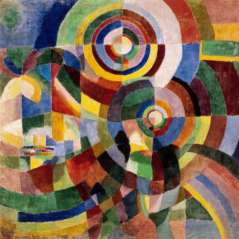
In the later stages of Orphism we can see a fusion of pure abstracted forms and an expressive interplay of colour (Fig 9. Prismes electriques) (Tate online, accessed 20/05/2020). The result is an expressive form of abstract art that draws attention to the flat surface of the canvas.

Orphism is a synthesis of Analytical cubism and Fauvism. Both movements rejected the traditional representation of three dimensional reality pushing them both towards near abstraction of form and a flattening of the image. The Orphists expressed themselves through bold bright colours based on colour theories of the time (Fauvism) and embraced the multiple fragmented viewpoints of cubism that ultimately led to pure abstraction.

Reflections

This was a very interesting exercise and it was fascinating to see how two movements could influence artists of the time. There seemed to be more opposing forces between Fauvism and Cubism than similarities, yet the two movements seemed to inspire the Orphists to create one of the earliest approaches to complete abstraction.

List of Illustrations

Fig 1. Diagram to illustrate Hegel’s dialectic of subjectivity and objectivity. At https://calmapossawi.tk/113-hegel-thesis-antithesis-synthesis-dialectic.php (Accessed 20/05/2020)

Fig 2. Barr, A.H. (1936) Cubism and Abstract Art. At https://www.moma.org/calendar/exhibitions/2748 (Accessed 20/05/2020)

Fig 3. Braque, G. (1909-10) Mandora [oil on canvas] At https://www.tate.org.uk/art/artworks/braque-mandora-t00833 (Accessed 20/05/2020)

Fig 4. Picasso, P. (1911) The Accordionist [oil on canvas] At https://www.guggenheim.org/artwork/3426 (Accessed 20/05/2020)

Fig 5. Gris, J. (1914) The Sunblind [oil on canvas] At https://www.tate.org.uk/art/art-terms/s/synthetic-cubism (Accessed 21/05/2020)

Fig 6. Matisse, H (1905) Joy of Life (Bonheur de Vivre) [oil on canvas] At https://www.henrimatisse.org/joy-of-life.jsp (Accessed 20/05/2020)

Fig 7. Derain, A. (1906) Bridge to Charing Cross [oil on canvas] At https://arthive.com/andrederain/works/323773~Bridge_To_Charing_Cross (Accessed 20/05/2020)

Fig 8. Delauney, R.(1912) The Red Tower [oil on canvas] At https://www.guggenheim.org/artwork/1020 (Accessed 20/05/2020)

Fig 9. Delauney, S. (1914)Prismes electriques [oil on canvas] At https://www.tate.org.uk/press/press-releases/ey-exhibition-sonia-delaunay (Accessed 20/05/2020)

Bibliography

Bois, Y-A (2004) with B.Buchloh, H. Foster, R. Krauss. Art since 1900 London and New York, Thames and Hudson.

Dempsey, A. (2002) Styles, Schools and Movements Thames and Hudson Ltd. London.

Esaulova, A. Bridge to Charing Cross At https://arthive.com/andrederain/works/323773~Bridge_To_Charing_Cross (Accessed 20/05/2020)

https://en.wikipedia.org/wiki/Orphism_(art) (Accessed 20/05/2020)

https://www.tate.org.uk/art/art-terms Accessed 20/05/2020

https://www.theartstory.org/movement/orphism/artworks/ (Accessed 20/05/2020)

https://www.metmuseum.org/toah/hd/fauv/hd_fauv.htm (Accessed 20/05/2020)

Exercise 4.4

Say to what extent Giotti’s painting can serve to illustrate the quote be Deleuze. (200 words)

Kiss of Judas - Wikipedia
Fig 1. Bodone di Giotto, (1305) The Kiss of Judas [Fresco] Scrovegni Chapel, Padua, Italy At https://en.wikipedia.org/wiki/Kiss_of_Judas (Accessed 15/05/2020)

“Let us imagine something which is distinguished – and yet that from which it is distinguished is not distinguished from it. The flash of lightening for example, is distinguished from the black sky, but must carry the sky along with it… One would say that the bottom rises to the surface, without ceasing to be the bottom. There is, on both sides, something cruel – and even monstrous – in this struggle against an elusive adversary, where the distinguished is opposed to something which cannot be distinguished from it, and which continues to embrace that which is divorced from it.” (Deleuze, 2014:361 cited in OCA UVC handbook 2016:105)

In Giotti’s painting ‘The Kiss of Judas’ (1305), we are able differentiate the figure and the background. As there is no use of single point perspective or illusion of three dimensions, there is no ordering of the space (Olkowski 1999:17). This means that the bottom of the painting (or the distinguished background) rises up to the surface of the canvas, just as;

‘The flash of lightening… is distinguished from the black sky, but must carry the sky along with it… One would say that the bottom rises to the surface without ceasing to be the bottom.’ (Deleuze, 2014:361 cited in OCA UVC handbook 2016:105)

The figures in the painting are distinguished from the background yet carry the background with it. Deleuze describes this effect as ‘monstrous’ (Deleuze, 2014:361 cited in OCA UVC handbook 2016:105). Form and representation have been destroyed through the creation of a depth-less surface and a flattening of the image.

The figures in the ‘The King of Judas’ fresco, are static and flattened. They have all been painted form a side on perspective which further emphasises the flatness of the image. This resonates with the Ancient Egyptian art and writing which places the human form in a similar manner. Alongside the figures, the background has risen to the surface. The relationship between background and figure creates an ‘indifferent difference’ (Olkowski, 1999) between contradictory and inseparable entities. Olkowski describes this as a ‘highly differentiated kind of pictorial space[s] that draws attention to the surface of the picture’. Comparisons can be made to Greenberg’s theory on modernist art where the emphasis was places on drawing attention to the flat surface of the canvas.

List of Illustrations

Fig 1. Bodone di Giotto, (1305) The Kiss of Judas [Fresco] Scrovegni Chapel, Padua, Italy At https://en.wikipedia.org/wiki/Kiss_of_Judas (Accessed 15/05/2020)

Bibliography

Belshaw, M. (2016) OCA Handbook for Understanding Visual Culture Open College of the Arts

Olkowski, D. (1999) Difference and Organic Representation in Gilles Deleuze and the Ruin of Representation (p.15-32) University of California Press: London At https://books.google.co.uk/books?id=xdzqBgAAQBAJ&pg=PA24&lpg=PA24&dq=difference+and+organic+representation+olkowski&source=bl&ots=OFdeHocgZY&sig=ACfU3U3GI7cLKySlrXjPMjoc3RWJTJO-XQ&hl=en&sa=X&ved=2ahUKEwjo3KDd9rXpAhW0uXEKHSBJDt8Q6AEwAHoECAgQAQ#v=onepage&q=difference%20and%20organic%20representation%20olkowski&f=false (Accessed 15/05/2020)

Design a site like this with WordPress.com
Get started